How Do I Read Options Risk Graphs?
Option Trading Risk Graphs - Definition
Risk Graphs, sometimes known as a risk/reward diagram, payoff diagram or profit/loss diagram, is a chart that presents the profit or loss of an option across a spectrum of prices.
Option Trading Risk Graphs - Introduction
So, what are these exotic looking payoff graphs and how can these so called "Risk Graphs" help you make better options trading decisions?
Nothing helps an option trader understand the risk / reward characteristics of an option trading strategy
or stock options position better than Risk Graphs.
Risk Graphs are visual tools, taking the form of a chart, presenting the behavior of an option position across a spectrum of stock prices at expiration
or at a specific number of days before expiration. Below are a couple of option trading risk graphs examples :
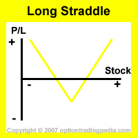
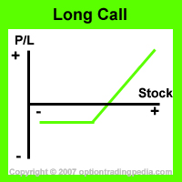
Risk Graphs not only are "signatures" for the different option trading strategies but are also dynamically constructed to enable
option traders using complex combination option trading strategies to better understand the net effect to one's portfolio at various prices.
Risk Graphs are therefore an essential option trading tool which all option traders need to eventually master for long term option trading success.
Here, we will explore exactly what Risk Graphs are, how to read and how to build a Risk Graph.
Option Trading Risk Graphs - Purpose
Risk Graphs allows option traders to instantly evaluate if the risk / reward characteristics of an option trading strategy suits the intended investment objective before actually executing it. Risk Graphs pin points at a glance where the areas of highest gains and losses are, allowing option traders to make more educated decisions without complex calculations. Risk Graphs also allow option traders to identify option trading strategies with similar risk / reward profiles, making synthetic positions easier to create.
Option Trading Risk Graphs - Elements
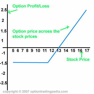
Risk Graphs are simple diagrams made up of 2 axis and a line representing option price at various stock prices. The horizontal axis or X-Axis represents stock price and the vertical axis or Y-Axis represents option profit or loss.
Risk Graphs - Center Point
Risk Graphs are usually centered with the current stock price in the center of the diagram. In the diagram above, the current stock price is $11.50 with breakeven point at $13. Breakeven point is the point on the Risk Graph, along the X-Axis where the Y-Axis equals to zero. It means that when the stock goes up to $13, the option neither increases nor decreases in value.
Risk Graphs - X-Axis
The X-Axis or Horizontal Axis represents a range of stock prices. The interval between the prices is usually as wide as to allow the complete representation of the option price action. The actual price is only important when determining exact breakeven prices or exact points where the highest profit or loss takes place. Otherwise, it suffice to know that stock prices decreases to the left and increases to the right. As the Rish Graph moves to the right, the graph line tells you what happens to the option price as stock prices increase.
Risk Graphs - Y-Axis
The Y-Axis or Vertical Axis represents the profit or loss of the option position. The higher up along the Y-Axis, the higher the profit. The lower down along the Y-Axis, the higher the loss.
Risk Graphs - Graph Line
The Graph Line represents the profit / loss action of the position across the spectrum of stock prices and is the most important element on a Risk Graph. One look at the shape formed by the graph line instantly tells a truck load of information to a learned option trading practitioner.
STOCK PICK MASTER!
"Probably The Most Accurate Stock Picks In The World..."
Option Trading Risk Graphs - 2 Types
There are 2 main types of option trading risk graphs. Profile Risk Graphs and Detailed Risk Graphs.
Risk Graphs - Profile Risk Graphs
Profile Risk Graphs are risk graphs built to represent the risk/reward characteristics of an option trading strategy or position with no specific numbers added to it. It is intended to give the option trader an idea of how the particular option trading strategy or position will behave before it is actually executed. Below are 2 examples of Profile Risk Graphs.


The Risk Graph on the left instantly tells you that it is a strategy with unlimited profit to up and down side and the risk graph on the right
instantly tells you that it is an option trading strategy or position with limited loss but unlimited gain.
Risk Graphs - Detailed Risk Graphs
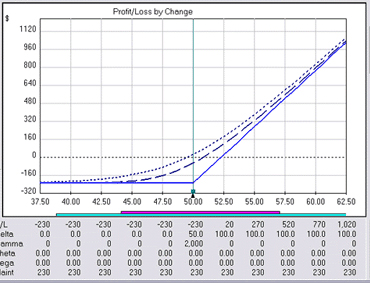
Detailed Risk Graphs are Risk graphs that are built using special option trading softwares, displaying exact prices and numbers so that the option trader can study and manipulate the graphs in order to arrive at a risk graph profile that suits one's investment objective. This is an extremely professional option trading tool which veteran option traders use to manage very large and complex option positions or to arrive at complex, customised combination option strategies. Below is an example of Detailed Risk Graphs.
Option Trading Risk Graphs - Reading Profile Risk Graphs
Unlike Detailed Risk Graphs, Profile Risk Graphs has no numbers at all. A Profile Risk Graph's purpose is to give an impression of the following :
1. Whether risk / reward of an option trading strategy is limited or unlimited
2. Which direction should the stock go to result in a profit
3. Where are the breakeven points in relation to current stock price
Whether Risk / Reward Is Limited Or Unlimited
To find out if the risk / reward of an option trading strategy is limited or unlimited through a Profile Risk Graph, one would look at the top end and bottom end of the graph line. If the top end of the graph line is pointing skywards, it is an option trading strategy with unlimited profit potential. If the top end of the graph line is pointing sideways, horizontally, it means that it is an option trading strategy with limited profit potential and will rise in price no further when a certain stock price has been reached.
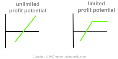
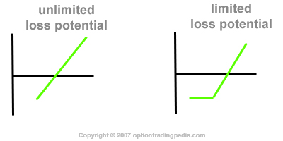
Conversely, if the bottom end of the profile risk graph line is pointing groundwards, it is an option trading strategy with unlimited loss potential. If the bottom end of the profile risk graph line is pointing sideways, horizontally, it means that it is an option trading strategy with limited loss potential and will lose no more money beyond a certain stock price has been reached.
Which Direction Is Profit
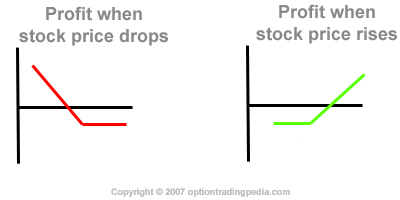
An option trading strategy turns a profit when the profile risk graph line crosses above the X-Axis (horizontal Axis). Remember, the center of a risk graph is the prevailing stock price when the chart is built and that stock price increases to the right and decreases to the left. If the profile risk graph line crosses above the X-Axis to the right, it means that the stock price needs to increase in order to turn a profit. If the profile risk graph line crosses above the X-Axis to the left, it means that the stock price needs to decrease in order to turn a profit. In volatile option trading strategies, The graph line actually crosses above the X-Axis both to the left and right. A good example is the Long Straddle profile risk graph above.
Which Direction Is Breakeven
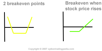
The Breakeven Point of an option trading strategy is presented on a profile risk graph as the point where the graph line touches the X-Axis (horizontal Axis). This is the point where the option position neither gains nor losses money. In volatile and neutral strategies, there are more than one breakeven point. Where the breakeven point is in relation to the center of the profile risk graph tells you which direction the stock price must go in order for the position to breakeven.
Putting It All Together
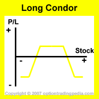
Putting it all together, the Profile Risk Graph of the Long Condor Spread below
tells us that it is an option trading strategy with :
1. Limited profit and limited loss
2. Profit occurring when the stock stays stagnant or within a tight range from the current stock price
3. Breakeven point is when the stock rises or falls significantly, beyond which the position will start to lose money
Option Trading Risk Graphs - Building A Risk Graph
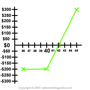
Building a very comprehensive risk graph representing a real, combination option trading strategy requires the help of softwares in order to calculate the exact price of the option especially before expiration. Here's we shall teach you how to build a simple risk graph representing a long call position at expiration step by step.
Step 1 - Doing The Calculations
First of all, we need to establish all the calculations for the Long Call option strategy.
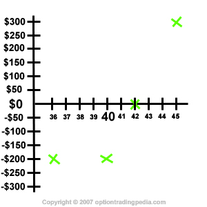
Assuming QQQQ is $40 now with its Jan $40 Call Option priced at $2.00. We decide to buy 1 contract of Jan40Call.
Breakeven Point = $40 + $2 = $42.00
Maximum Profit = unlimited
Maximum loss = $2.00 x 100 = $200 when QQQQ expires at $40 or lower
Profit at $45 = $45 - $42 = $3 x 100 = $300
Step 2 - Drawing The Axis
First of all, draw the X and Y axis.
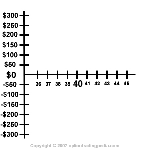
Step 3 - Labelling The Axis
For the X-Axis, we put the current stock price of $40 at the center and then draw increments of $1, making sure to cover beyond the breakeven point of $43. For the Y-Axis, we make sure the Y-Axis covers at least up to $300.
Step 4 - Marking The Major Points
Mark down on the chart the breakeven point, profit at $45 and maximum loss point.
Step 5 - Joining The Points
Join the points on the risk graph together and you are done!

|
Can't Decide Which Options Strategy To Use? Try our Option Strategy Selector! |
| Javascript Tree Menu |
Important Disclaimer : Options involve risk and are not suitable for all investors. Data and information is provided for informational purposes only, and is not intended for trading purposes. Neither www.optiontradingpedia.com, mastersoequity.com nor any of its data or content providers shall be liable for any errors, omissions, or delays in the content, or for any actions taken in reliance thereon. Data is deemed accurate but is not warranted or guaranteed. optiontradinpedia.com and mastersoequity.com are not a registered broker-dealer and does not endorse or recommend the services of any brokerage company. The brokerage company you select is solely responsible for its services to you. By accessing, viewing, or using this site in any way, you agree to be bound by the above conditions and disclaimers found on this site.
Copyright Warning : All contents and information presented here in www.optiontradingpedia.com are property of www.Optiontradingpedia.com and are not to be copied, redistributed or downloaded in any ways unless in accordance with our quoting policy. We have a comprehensive system to detect plagiarism and will take legal action against any individuals, websites or companies involved. We Take Our Copyright VERY Seriously!
Site Authored by