|
|
Question By Ward
"Why Isn't Protective Puts Bearish?"
Dear OptionTradingPedia guys - thanks very much for your site - it is really helpful - but I have a stupid question - a newbie question though I can't seem to study my way out. as you say in Protective Put topic: "If the price of the underlying stock continues to rise, the put options expires out of the money eventually, incurring the cost of the put options as expense. " which implies to me that the graph should be RED and the rising line would go to left as the put increases in value as stock goes down in price. I'm sure I'm missing something here and if you could be so kind to assist
Asked on 31 August 2009
|
Answered by Mr. OppiE
Hi Ward,
Thank you for enjoying www.Optiontradingpedia.com.
Indeed, you are missing something in your consideration for the direction that a Protective Put's
risk graph should be taking. You would be right that the risk graph should be a red one, indicating a
bearish options trading strategy, rising towards the left if the protective put consists only of
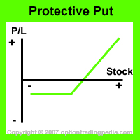
put options. However, what you missed in that consideration is the stock itself. Yes, a protective put is a strategy that consists of the underlying stock plus its put options. The put options act to protect the profits that the stock has made so far.
In a protective put, the underlying stock rises in value faster than its put options, as such, when the stock rises, the overall position profits eventhough the put options eventually go out of the money and expires. When the underlying stock falls below the strike price of the put options, the put options would then rise in the exact amount that the stock value falls, thereby hedging against any loss below its strike price completely. However, since the put options do not ever rise in value faster than the stock falls in a protective put options trading strategy as an equal number of puts and shares are bought, there will be no value gained when the stock falls. This is why the risk graph of a protective put options trading strategy is one that is green and rises to the right. This is because the overall position gains in value as the stock rises.
To better illustrate this, lets tabulate the net movement of a hypothetical protective put position.
In the illustration below, the stock was initially trading at $50 and its $50 strike price put options are bought for $1.20. As such, the initial position value was $51.20. The table presents the net effect at expiration of the put options across multiple stock prices in order to illustrate why a protective put's risk graph is a green rightwards rising one.
|
Stock Price
|
Put Option Price
|
Position Value
|
Net Effect
|
|
$30
|
$20
|
$50
|
- $1.20
|
|
$40
|
$10
|
$50
|
- $1.20
|
|
$50
|
$0
|
$50
|
- $1.20
|
|
$60
|
$0
|
$60
|
+ $8.80
|
|
$70
|
$0
|
$70
|
+ $18.80
|
If you plot the above into a chart, you should get something like the risk graph of a protective put below:

In conclusion, all you missed in your understanding is the fact that the stock needs to be taken into consideration in a protective put options trading strategy as this is a strategy that consists of both stock and option. I hope this clears up your doubt and helps you understand the protective put better.


|
Make Explosive Profits From Covered Calls!
Perfect for all Options Traders! Original eBook by www.Optiontradingpedia.com!
This eBook Covers:
:: The Secret to looking for the PERFECT stock for Covered Calls
:: The number of ways to write Covered Calls
:: The two ways of measuring Covered Call returns
:: Most Importantly, how to automatically look for high yield Covered Call opportunities to make up to 25% a month!
This $29.90 eBook teaches you all these and more!
Average Reader Rating : 4.5 / 5
www.Optiontradingpedia.com is a Masters 'O' Equity company and uses Masters 'O' Equity payment gateway
|
Response by Ward ...
How cool - thanks for the response. You understood my question better than me!
Reply by Mr. OppiE...
Response by Others...
|

